The Colours of Folkestone
A street photographer’s dream location
Seeking out contrasting & complementary colours
Having a purpose for your street photography is important
Today I’m going for a walk centred around the Creative Quarter of Folkestone to do some street photography. And I’ve got a project, which means I’m going out with purpose. And having a purpose is important. A purpose helps you focus, if you’ll excuse the pun. It helps us to develop new skills and develop our visual storytelling ability. And isn’t that what photography is all about, a visual storytelling medium?
Folkestone’s Resurgence
Folkestone has undergone a resurgence over the past 10 or so years. In particular, the harbour and Old High Street area. The creative community have embraced the town, and moved in. Stores, galleries and studios have sprung up, and vibrant colours have cheered up what once was a very dreary run-down area, best avoided.
A few hours spent waking around and exploring with a camera here, are a few hours very well spent. I believe it’s important when we head out with our camera to do some photography, to have a plan. A reason to go out. I like to give myself a project, like a client assignment if you will. My project today, inspired by the vibrant creative atmosphere this place has, is to capture the colours of Folkestone.
The Bayle
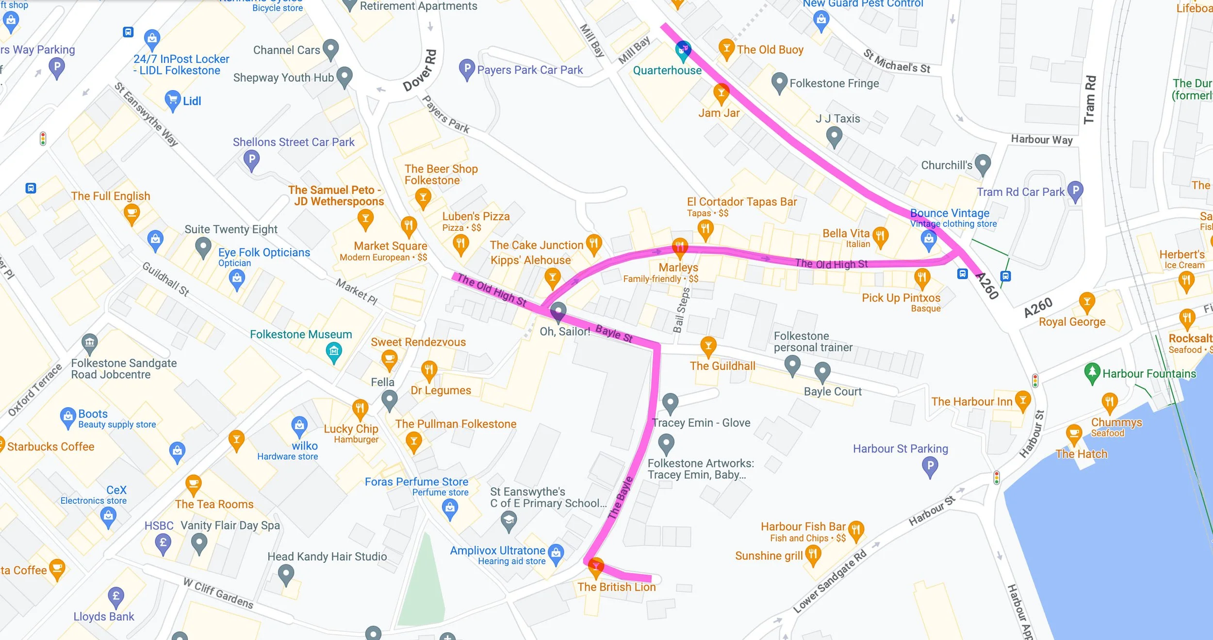
We’re starting in a little area called the Bayle, near the top of the Old High Street. The word Bayle comes from the Norman word Bailey, which means castle yard. There was a Norman castle here in the 11th century, and actually before that, evidence of a Roman settlement has been found dating back almost two thousand years ago to the 1st century. Folkestone is packed with some interesting history.
This little pocket of Folkestone is almost hidden, very few people who visit the town find it. The lovely old buildings here have been cheerfully painted, and there’s a lot to photograph. A great place to start my project.
Folkestone’s Old High Street
Next I head down the Old High Street, a steep and narrow cobble-stoned road that takes us down the the harbour. This is the heart of the Creative Quarter, it’s a street that hasn’t changed much in over 100 years. It’s packed with interesting little boutiques, gift shops and art galleries, and also some really great places to grab a coffee or a bite to eat. In the 80s I can remember tacky souvenir shops, a rock shop, fishmongers, and lots of amusement arcades. By the late 90s it had became a rough area, full of boarded up shopfronts.
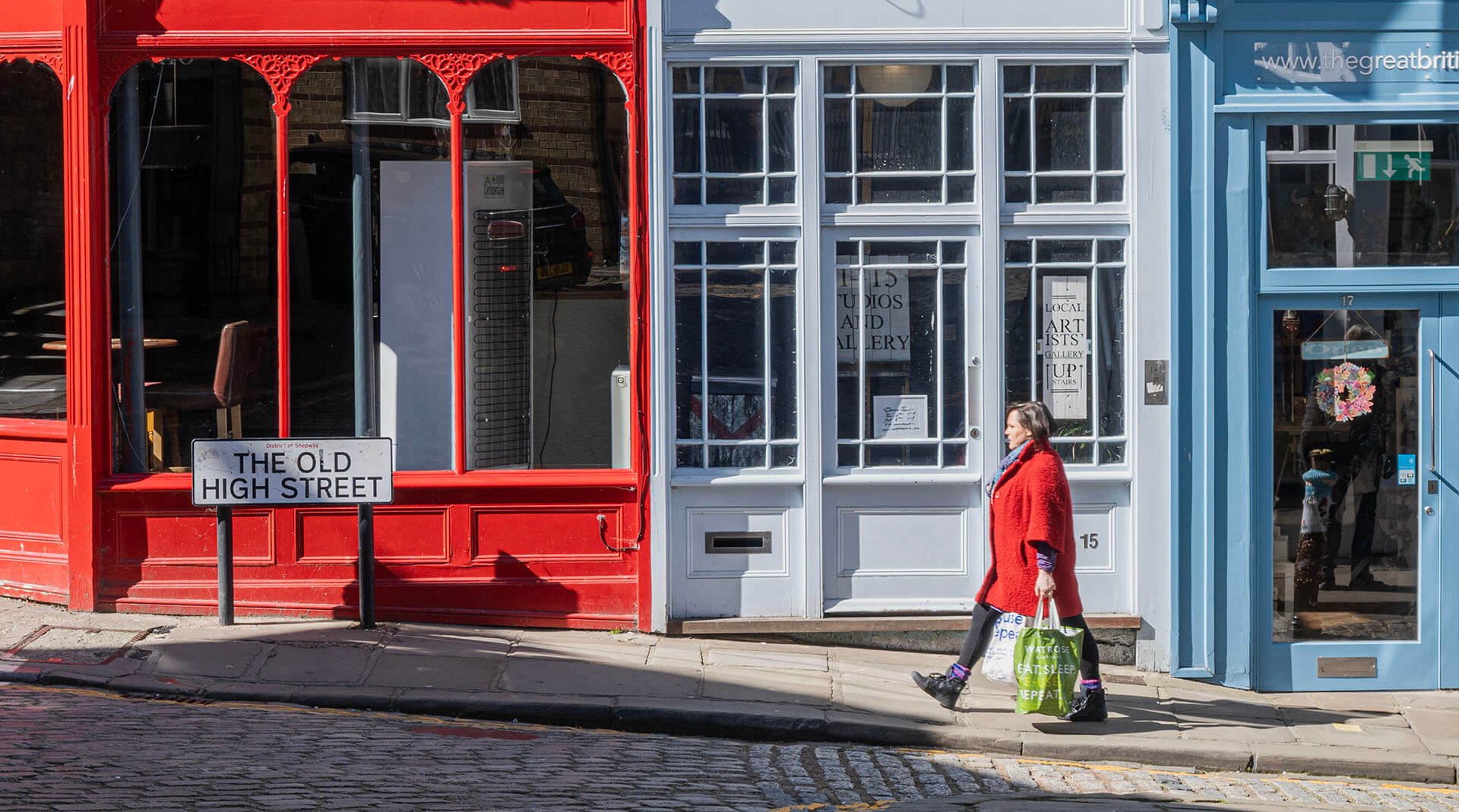
My preference when exploring a town is to wander around and look for interesting photo opportunities, but here, It’s worth finding an interesting composition, and waiting. The top of the Old High Street, facing Kipps Alehouse, is a great spot to spend a few minutes. I love the contrasting colours of the buildings, so I spend 15 minutes waiting for someone to walk into frame with a solid coloured jacket, to complete the composition. I end up with quite a few photos, doing that!
Making my way down the Old High Street, Steep Street Coffee House, a green and orange building, is another colour combination that creates a perfect backdrop.
There was a girl sitting outside this coffee shop wearing a coat, the colour of which complements the colour of the building perfectly. These can be hard to find, It was complete luck. And observation. I was actually looking for these plays on colour. If I wasn’t I might not have seen it. Great photography, for me, is about looking and seeing.
At the bottom of the Old High Street, there's a fantastic composition awaiting. Three buildings each with a primary colour, now that is vibrant! I needed to hang around here and hope someone comes along wearing a colourful jacket or coat that works with the primary colours. Preferably a solid colour.
Tontine Street
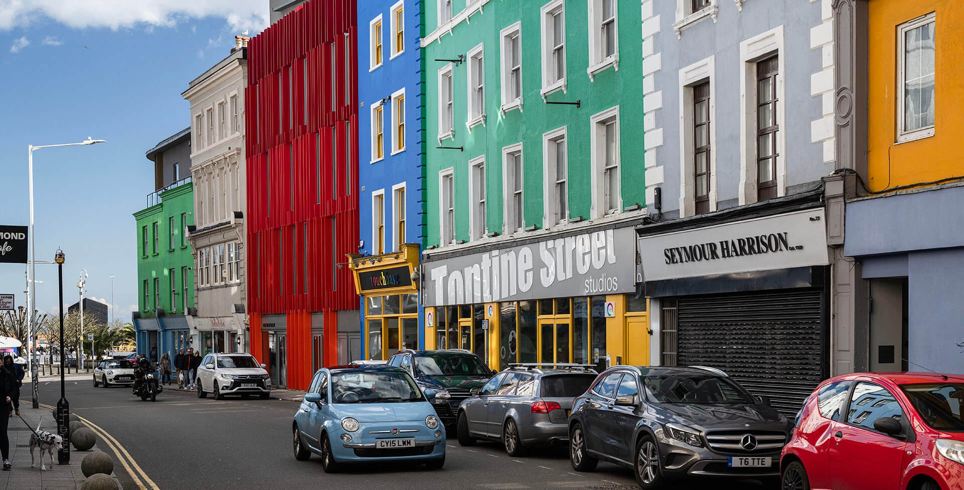
If you head right at the bottom of the Old High Street, you come to the harbour, if you head left, you turn onto Tontine Street. This was a notoriously bad place to venture just a decade or so ago, but has been a major part of the rejuvenation. It’s now home to some very colourful buildings and businesses. Here you’ll find the Quarterhouse, a new arts and entertainment centre; and The Workshop, a place for small businesses and creative freelancers to share working and meeting spaces and business services. I didn’t spend a lot of time on Tontine Street, and didn’t stop to shoot anything as time was running out. I need to return to give it the full attention it deserves.

Tontine Street has a different vibe than the Old High Street, but is equally as colourful.
The Study of Colour – Some Thoughts
What I’ve really concentrated on today with my little project, is the study of colour, particularly contrasting and complementary colours. This is a really good exercise, it helps to train yourself to see better. Colour photography is harder to do well than black and white photography in my opinion, because we need to look harder, we need to look for things we don’t usually look for. Black and white photography is all about light and shade, textures, tones, and they can be easier to see than colour. The emphasis with black and white is on contrast and creating an emotive image, and colour can be a hinderance to that.
Most people choose to shoot black and white when doing street photography, and focus on contrast of light. When most people do something a certain way, that’s reason enough for me to take a rebellious stance and do something completely different! I’m not knocking black and white photography, I’m going to be doing a lot of it this year. Black and white photography is my roots, it’s how I started out when I developed a passion for the craft, way back. It’s what I studied at college. But it just doesn’t make sense to do black and white in a place like this though, with so much vibrant colour everywhere!
What I did here in Folkestone was an exercise, and I suggest you try something similar. The primary objective was to look and see in colour, and capture it. It doesn’t matter if the photos aren’t exceptional in their own right, create an emotional response, or tell a story. We have to train ourselves to think colour, and the best way to do that is get out and shoot as much as we can. And that includes shooting people with their backs to the camera, not something I would normally recommend.
One of my favourite things to do is look for scenes that contain just two colours, that sit on the opposite end of the colour wheel. Preferably one colour dominating. One of the best examples of this from my Folkestone outing is this grocery store owner standing in his store doorway holding strawberries (below). The green painted store and his green apron contrast nicely with the strawberries he’s holding, and that sit in the window display. This kind of photo gives me great satisfaction.
I hope this inspires you to go out and try something similar. Watch the video below from my day out, and go do some shooting yourself, seeking out complimentary or contrasting colour is a fun project.
Green and red sit on opposite sides of the colour wheel, something I like to look for when shooting colour photos.


